Thursday, 29 October 2015

Life Drawing October/November

LIFE DRAWING 
These two pieces of my life drawing work I really love. The first was to create a a pieces just using the shadows, although it seems like there is line work in this, this is just using shadows and tones from the charcoal. 


I enjoyed this a lot and it help me to improve skills for the future of life drawing and drawing in whatever media, and bettered my understanding of shadow forms and lighting. 


This next piece was a foreshortening process that I think turned out very well and I really enjoyed the shading process of this. I feel as if improving with my drawings and overall understanding of the body and anatomy. I am also looking forward to the future of these sessions as they are great. 


Sunday, 25 October 2015

VISUAL DESIGN - LAVA MONSTER WEEK_05_

LAVA MONSTER AND ROCK MONSTER

For our next visual dosing lesson, we looked at rock monsters and forms of lava. The class work was to add lava effect to a picture of a model we were given.  First I removed the background and tided the image, then added a dark background and made the image overall much darker, so the lava effects could show through. Then I added lava using different layers and FX tools on Photoshop, giving the piece a glowing outer effect. I am very pleased with the result and believe its better than my Own from scratch creation/idea, with I did struggle a little with. 


Then homework was to then come up with our own lava monster. To start, I crated a mood board for reference, to understand the lava position and feel. 


After this, I then did some sketches of monsters that were completely different to each other, to give myself a variation of ideas when doing my own. 


The first design was a rock monster creature, that I wanted to be infused with the surrounding rock and are, I really liked the design and the form of this creature, and It was the one I eventually chose to become the finally piece. 


My second design I also like, as it is also attached/ coming out of the rock, and is more angular and thing looking. This was going to be the one used for my final color piece but I found the previous one more striking in terms of the feature within the sketch. 


This third sketch Is my least favorite, because I didn't draw its full body, and found it to be more alien than lava based creature. Although if I used this, I would have made lava come out of its mouth as well as on the body. 


My final lava design I think is good but not as good as the one done in the class lesson. The outer glow effect and colour works, however i f doing this again I would have made the body more visible and followed the cracks in the rocks more effectively to bring out the subtle lava rock creature, in full form, like the class work. Overall I like its cartoon style and and the color, although I believe it still could be further refined to be a much better piece. 


Friday, 23 October 2015

3D DESIGN - TUTORIALS


MAYA TUTUORIALS


Some more tutorials that we had to create in MAYA. These were the column and the terrain. The column was much harder to create as it consisted of many different MAYA tools, in order to create something that was good looking and fit the build of a column.


The terrain was easier, as this consisted of getting rock, grass and dirt textures combined together using the lamberts, and matching the specific colours to there place in order for the textures to blend.
 

Wednesday, 21 October 2015

3D DESIGN - BATTLE ARENA VERSION 2


SECOND VERSION OF MY BATTLE ARENA

The second process of design for my battle arena, stated to add more to it, I added an additional top part to the island so it had more structure and felt more scifi industrial. Again I want to add more island, as Iam going to next, but I firstly felt the initial island needed some more too it. I like the design of this and it fits well with the other parts.

I've also added some features such as rock shades coming from the roof section and also some to the center, these can act as props in the final version.


GAMEPLAY AND INTERACTIVITY - FIRST PERSON SIMULATOR ROUGH GREY BOX

GREY BOX ROUGH

This was the first version of my grey box first person simulator. I started with a simple idea based off of my rough sketches and designs. I then advanced the design with more rooms on the top level and simplified the tunnel system to be more in keeping with a sci fi environment.


Sunday, 18 October 2015

VISUAL DESIGN - PIXEL ROBOT WEEK_04_

PIXEL ART - ROBOT, AND ROBOT IN SCENE

The brief asked us to create a robot using pixels, on Photoshop. I set the brush, rubber and the page layout, to fit this style and then began to draw. In the lesson, I constructed the main head, body and backpack shape, these were all going in a 30 degree motion/ angle so it gave off a 3D look.

For homework, I finished off the body, and then colored in the robot. I wanted to make sure that my color wasn't just two shades for each that I picked, I wanted to show a lot of variation in where light and shadow would be on my robot. I think that this adds a lot to my actual piece and makes it more than a just a box on top of another.

I am happy with the final outcome and it does meet the brief. however if I was to to this again, I would perhaps change a few things. One would be to maybe add an antenna to his head, and a smaller cylinder under the large one ad a rocket pack, then maybe some flames to come out. Other then that I really enjoyed this process, tricky at first but then got easier, and am happy with the outcome. 


I added the robot to the scene and but him next to Einstein, as if hes walking away from him. I did position him on the convey belt as if to say "next toy" but he was less noticeable when there. 


Sunday, 11 October 2015

GAMEPLAY AND INTERACTIVITY - MAP, STORY BOARD AND ONE SHEET. WEEK_03_

THE MAP - GAME LEVEL DESIGN 


A sci fi landscape, with a research facility in the side of the rock face, due to the crews investigatory efforts. 


destroyed and in ruin, as a captain awakes to find the crew gone and the base destroyed. 


I wanted to create a landscape that was sci fi orientated, and I also wanted to have some sort of base or facility in the level as well, so there is some added variety. 


starting from the bunker rooms to the elevator pipe system and then into the open landscape. 


STORY BOARD 


The story board takes the process of my map level design and shift the view to first person as this is what the game will be played in. I tried to make sure i visualized the aspect on the map in the POV view.


ONE SHEET 


With the one sheet I was able to construct a sci fi game of my choosing and explore some of the aspect associated with it, for example the main character, story and the mechanics. This also helped me to visualize the landscape better and the thing that could happen within this more thoroughly as I had come up with a story to the world. 

VISUAL DESIGN - FUTURE WEAPON WEEK_03_

FUTURISTIC WEAPON VISUAL DESIGN HOMEWORK 


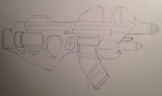
The brief asked, to create a futuristic weapon, that was on profile view as a final outcome. This also included initial research and sketches. The mood board  I put together contains a selection of different weapons from concept art, film, and games. All helping me to get inspiration from. 


Some initial sketches that I created, that show different variations of a handgun model of weapon. I later decided I wanted to make a gun that was sightly bigger and more futuristic looking, as I found my early designs to be not quite there. 


I firstly wanted to create a gun that was retro with a sci fi twist, however, the designs I did ended up begin a bit boring and again to too futuristic. I added some laser sights and made the barrel more clunky, however it made it look a bit odd and not how I wanted it to look. 


Then I decide to go for a shotgun type blaster, however I immediately didn't like this design and firstly thought it looked very generic and flat, and also I had draw aspect of it out of scale so this ultimately made this design one I didn't want to go ahead with. 


I finally found a design I was happy with, and was ready to start coloring in. I went for a more blockier and chunky gun, and one which was a sub machine gun, not a hand gun. 


I decided to color on Photoshop, and I went with a very cartoon and almost cel shaded type aesthetic. I think my overall final design does meet the brief as a futuristic weapon. The color and lighting effect also makes this piece stand out more, and bring the cartoon feel to life more. Some problems I have with it, include, the rear left side of the gun feels a bit basic and could have used some more detail, and perhaps the front top barrel, could have been smoothed out more, instead of the rough look of it currently. Other than that, I am pleased with the result. 


Saturday, 10 October 2015

3D DESIGN - BATTLE ARENA VERSION 1

INITIAL STARTING DESIGN OF BATTLE ARENA

My first design for the battle arena has started off quite well, I have kept to a simple shape and have used the mood board as good help, to get the design process going in creating something SCFI and visually interesting. Hopefully over the next few weeks I can maximize its potential ad add some additional parts, so its not just the lone island in the sky. Although If its one object, Its much easier to texture. However I want to have some more islands the come together to for the arena.


Friday, 9 October 2015

VISUAL DESIGN - ELF AND DWARF WEEK_03_

VISUAL DESIGN ELF AND DWARF

Create a Elf and Dwarf character, that was proportional, by using ovals as the basis to construct height from.


For the next visual design class, we had to create two characters, using height perspective. The dwarf was measured to be four ovals tall, and the elf was nine and a half. I used layers of color and shadow that built up to form the finished product. I am happy with the result, as it has a carton approach to it and does look fantasy based.

 However in reflection to my pieces, I would add more detail to the dwarf as I feel it looks a bit flat when compared to the elf. The elf on the other hand, I believe needs more color tone and variation, to really add to the body form of the character. These are thing I would change/ improve on If doing this again. 


Overall I am happy with the results and feel as if I have met the brief well, this exercise has helped me to understand different body types and the proportions of them. It has also been useful to do the life drawing, as it benefited me in this as well, in terms of the postilion and shape of the body. 


LIFE DRAWING WEEK_02_

LIFE DRAWING 


For the next life drawing session, we were presented with a male model. This, like the previous would help us to develop out figure drawing skills and find different approaches that we are not used to doing, and adjust to theses. 


Again we were timed on each exercise and it was varied time also. The drawing above was a collaborative work which I sated and, and then was rotated so two more class mates would then correct and work over it. This was a good process, as it allowed others to helpfully critique your work and ad any adjustments, if necessary. 


This selection of drawings, was done by me, using my right hand (the opposite of what I usually use). This was also very unique as we had to adjust canvases to the correct position, and were set task like, a continuous line drawing, using the opposing hand. I am very pleased with the results, I didn't think they would be this good, especially with my hand i have never used to draw from before. 


Sunday, 4 October 2015

3D DESIGN - MAYA GREY BOX

This is a labeled document, describing all the different aspect of my grey box battle arena work so far. I have linked images found on my initial mood board to this, in order to show what I want to achieve and where this would then fit into the design I have made/ am making. 


FCGM4009 :VISUAL DESIGN 15/16 WEEK_02_ CRUSTATIONS


For our next homework task, we had to create three characters that were based on crustations. These characters were to be created in Photoshop, by using a silhouette approach. This meant that we started by drawing out a silhouette of a shape, then worked over this with shading and detail, and then color. These were in the style of a concept artist who also works in this style. 


The first of the characters (left), is my personal favorite of mine and the one which i feel as if I have made the most effort and skill with. This is because of its subtle use of color and the crustation feel to it. however on this character, I don't like its mouth, as this looks a bit too cartoon like.

The second of my creatures, looks good and I'm happy with most of it. The only thing I would change if doing it again, would be the addition of more detail on the shell head, as its not too clear that the head is supposed to be shaped like a shell. Also the mouth I would darken to reveal the teeth more. The color I surprisingly like as it gives a visual element to it that is quite outrageous yet fun.  

The third one I like, because of the detail and brush variation I have used. The head however is too carton and not crustation looking. This would be something to change If I had a chance to do it again. 

Inspiration, mood board, that I put together to help me come up with ways of structuring my different creatures. 


FCGM4011: GAMEPLAY AND INTERACTIVITY15/16 WEEK_02_BLOGGING

DECONSTRUCTIVISM


Decontructivism:
Is an art movement, that was created in the 1980's, and is the further development of postmodern architecture.


This particular movement was influenced by the process of building deconstruction, and is a expansion of post modern architecture. This movement, encourages radical freedom of the forms, which are created and, are focused on the elements of the structure that are more complex and free moving, rather than the controlled and ordered functionality of the standard building structure.


Postmodern Architecture:
An architectural art movement that took off in the 1970's and has remained a big influence and impact on the architecture of the modern day world. Unlike the Decontructivism movement, this focuses on the more traditional side of architectural form and placement, being more neat and rectangular, as opposed to the Decontructivism which uses right angles and grids.


Decontructivism is often describe as a sort of "Controlled Chaos" in which it focuses on the finer detail, like the distortion of the roofing, walls and the interior volume, all to express the feeling of fragmentation within the buildings themselves.


several different and all very famous Decontructivist and postmodernist building have been built and displayed in many different places across the world. These include, OMA/Rem Koolhaas’ Seattle Central Library, Washington,  Daniel Libeskind’s Jewish Museum, Berlin, Germany, two more in Ohio, and another in Paris. Each are very visually stunning and intreaging, and have won many awards. Perhaps the most famous of all these Post modernist Decontructivism buildings is the Guggenheim, located in the Bilboa museum in Spain, by Frank Gehry’s.


http://weburbanist.com/2011/06/13/deconstructivism-7-architectural-wonders-of-the-world/
https://www.boundless.com/art-history/textbooks/boundless-art-history-textbook/global-art-since-1950-ce-37/the-nineties-238/deconstructivism-850-10854/
http://www.merriam-webster.com/dictionary/deconstructivism