Wednesday, 30 March 2016

3D DESIGN - STATUE PROCESS


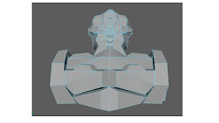
This was the model sheet I made, with topology lines, so I was able to go over this in side, front and perspective views in Maya to closely create a 3D version of this initial mood board. 
After the initial mood board and model sheet of my mock statue that I made, I then took the images into MAYA and used the method I used for the first head to create my own statue. The process was great and I have learnt many new techniques in maya, so of which I can use to improve old work such as using vector merging for cleaner results, for the battle arena. 

The first step was the half face section. I completed the whole side of the face. Once done, I then mirrored the mesh and connected the middle section. This was much easier that trying to copy wat you have all ready done. 


I then extruded done and over the template I created so I could create the rest of the body. As I worked down, I adjusted the back to how I wanted it, this way I could follow the curved back. 


I continued the mirroring process throughout the model all way down. This way it kept its symmetry. 


Once I had done all the mirroring to the body, I added some extruded details and removed some of the inside faces. I am very pleased with how the statue turned out as looked a lot like my initial designs/ideas and fits well with the theme of the battle arena, which was the cold war inspired sci fi robot. 

When texturing I will use a worn dark to mid grey tone texture with some weathering and broken parts, which I will paint and create in Photoshop. As for the position I will have the arms come down and in like the original statue but with more curve to the arm. 


Wednesday, 23 March 2016

LIFE DRAWING LAST SESSION


Some quick warm up sketches to help get a feel for the clothes on the model. As this session the model was clothed. This allowed for some unique texture patterns and marks I could make.


I used the sides of the charcoal, to suggest texture on the robe.


Overall I have really enjoyed the life drawing session. They have helped me to understand the human form better and also improve my drawing skills significantly. I hope we continue this next year even if session are more sparse. I have seen a great improvement in my work, from the start of the year till now, and it is great to see this process.

Wednesday, 9 March 2016

VISUAL DESIGN - SPEEDPAINT - HOUSE

VISUAL DESIGN - SPEEDPAINT - HOUSE
The next speed paint session was to recreate an image of a western house. However, we needed to make the image use the rule of thirds, or the golden ration.
This was a quick half of class session that didn't take long. Iam quite pleased with how this turned out In the short amount of time. However I would have liked to add more texture by using different brushes, but other than that I like this piece and enjoyed working on it.


Monday, 7 March 2016

CONSTRUCTION VEHICLES - ANGLES AND CIRCLES

CONSTRUCTION VEHICLES - ANGLES AND CIRCLES    

For this classwork we had to come up with concepts for a futuristic construction vehicle using angular shapes, and ones with circular shapes. This was to get us familiar with shop concepts before we started the homework which is our own ship. 


I started with the angular shapes version and really enjoyed this process of creation. I found myself wanting to create more different design as I moved forward wand was excited by the out come I would get. I worked quickly and glided through these designs. Although they may appear a bit messy, I find working quickly and letting my hand glide is a great way to create the specific shapes and parts of the vihichels or any design. However I do need to work more on the neatness of my work. 
I found out of all this was my favorite, because it wasn't too futuristic and you can still tell its a construction vehicles, it also sticks to th brief of angular shapes. Like I mentioned earlier, I need to work on neatening my work up so it looks more professional. 


The circles section of the brief I initially found easier, but when continuing with the brief it then became more challenging to create construction vehicles using mostly circles then angular shapes. I like all my designs as they are all different from each other and not overly similar. 

I finally chose this to be the one to got with, as I like the large clunky old feel to it. this was the only one I drew front facing as I wanted yo show the dirt scooped on the front as well as both the side legs. I still however need to keep improving on my presentation and ability of neatness within my work. this is something I found quite obvious when doing this brief. 


Sunday, 6 March 2016

VISUAL DESIGN - TREE WITH CHARACTER

TREE WITH CHARACTER 

This weeks visual design work, was to create a tree which had character. This meant a tree that was very contorted and expressed different visual elements that are interesting. Instead of just a tree with a face.


I firstly created a mood bard for reference to help me get some interesting shapes and curves when doing the sketches. This was very helpful as it gave me something to work from when coming up with shapes and structure to the trees. 


I used the silhouette method to do sketches and these turned out well, and I enjoyed doing these small sketches. I found myself deciding what tree I would eventually use, as I liked all the sketches I drew out. This was a Fun and great brief and I really enjoyed it. 


The two I found very interesting on this sketch page, was the bottom left and middle right. I found they were great to adapt and I really wanted to explore theses further. 


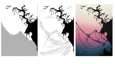
After the sketches I quickly came up with another design, that I found myself liking a lot. I planned a quick composition of a landscape with the tree in foreground, and also applied the golden ration to it so that the mountains guide the eye to the focal of the tree. 

Once I had coloured the piece, I added in some rim lighting. This was great to use as It gives the pieces some more levels instead of looking a bit flat. This was also very good to use and get myself into using in the future. 


I finally added some clouds and then a glow around the sun, to add some extra details to it. I found the rendering for this quit difficult as I didn't know how to properly balance the mountains from the tree. I still feel as if the piece lacks something and I may explore this piece further when I have available time. However I still enjoyed this brief a lot and want to work on improving my lighting skills and painting.