TREE WITH CHARACTER
This weeks visual design work, was to create a tree which had character. This meant a tree that was very contorted and expressed different visual elements that are interesting. Instead of just a tree with a face.
I firstly created a mood bard for reference to help me get some interesting shapes and curves when doing the sketches. This was very helpful as it gave me something to work from when coming up with shapes and structure to the trees.
I used the silhouette method to do sketches and these turned out well, and I enjoyed doing these small sketches. I found myself deciding what tree I would eventually use, as I liked all the sketches I drew out. This was a Fun and great brief and I really enjoyed it.
The two I found very interesting on this sketch page, was the bottom left and middle right. I found they were great to adapt and I really wanted to explore theses further.
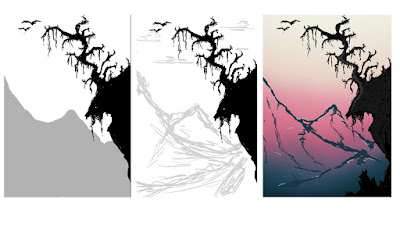
After the sketches I quickly came up with another design, that I found myself liking a lot. I planned a quick composition of a landscape with the tree in foreground, and also applied the golden ration to it so that the mountains guide the eye to the focal of the tree.
Once I had coloured the piece, I added in some rim lighting. This was great to use as It gives the pieces some more levels instead of looking a bit flat. This was also very good to use and get myself into using in the future.
I finally added some clouds and then a glow around the sun, to add some extra details to it. I found the rendering for this quit difficult as I didn't know how to properly balance the mountains from the tree. I still feel as if the piece lacks something and I may explore this piece further when I have available time. However I still enjoyed this brief a lot and want to work on improving my lighting skills and painting.


No comments:
Post a Comment