2D GAME - INITIAL CONCEPT ART AND MOOD BOARDS
After deciding the what our key mechanics and style of the game would be, it then came time for the initial concept art for characters, backgrounds and weapons.
The first thing we decided was to have a female lead protagonist character. We found that having the long hair wold add to the feel of the characters movement without having the clothes too flowing. I created this mood board to show some ideas for our character, the character would be Disney/dreamworks minimal style as at first we were going to do this style but did quickly decide to do pixel art as the player wouldn't see much detail when playing.
The first thing we decided was to have a female lead protagonist character. We found that having the long hair wold add to the feel of the characters movement without having the clothes too flowing. I created this mood board to show some ideas for our character, the character would be Disney/dreamworks minimal style as at first we were going to do this style but did quickly decide to do pixel art as the player wouldn't see much detail when playing.
At first the designs started off as a muscular female, similar to lara croft. However we decided we wanted a more agile character who could move fast and appear more streamline.
Once the build of the character was found, we started looking at what clothing we could use and what could be used to show movement in game. The first thoughts were a puffer bomber jacket and large baggie pants, however we found this didn't look good at the size we wanted and didn't show movement well.
So we opted for a more streamline and less clunky costume. This consisted of legging type bottoms and the jacket which was less puffy and more tighter fitted.
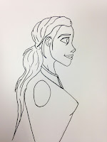
After this I played around with the facial construction for the character. I found the cartoon approach better than an realistic one, to fit the themes of the game, and long hair instead of short, as the hair could act as a way of showing motion. I also found the design I didn't like, and thy were in need of serious adjusting, if they were to look better than a "crazed" character seen in the left hand image.
I refined the design to be more dreamworks/disney style which is what I continued throughout all my initial concepts for the characters.
I the made a quick sketch page of different poses, very rough, that I could use when it comes to ding the pixel art animations for the game. These were very helpful and helped communicate the feel of movement in the character.
Here were some different face expressions I did for the cartoon concept art, these were good to do as I wanted to do more poses for the character in this version of the art, however we decided we were going to move ahead with the pixel art.
This was the final version of concept art we decided to go ahead with, and develop into pixel art. I really enjoyed this process and liked coming up with the different looks for the character. This style also fits with the enemies concept art style.
I then decided to do a model sheet of the character with her sword to show size difference and clothing hair etc.
This is some other concept art from another member of our group. We decided from this that the characters clothing would be quite dull and basic, and she would have bright hair. The hair would suggest motion as she moved, as before we said a scalf or the cloths would do this, but we decided to make it more simple and have just the hair and a ribbon attached to the sword to show movement.
Another earl piece of concept work, when we were deciding what the character would look like and what she would wear, another group member thought that goggles would be a great choice because of the characters constant fast movement. This first concept then helped us to move forward and change aspects that would be better for use, for example longer flowing hair as opposed to short motion less hair.
This sword mood board I made when we were coming u p with the design of the sword. It originally started off as a giant rectangular sword, however we found a more streamline cutlass type sword would fit the them of movement well and also look better with the character.
I then drew up a front facing image of the character, so that I could colour it like the other pieces of concept art for the enemies.


No comments:
Post a Comment