Sunday 28 February 2016

GAMEPLAY AND INTERACTIVITY - 2D GAME - PIXEL ART AND ANIMATIONS


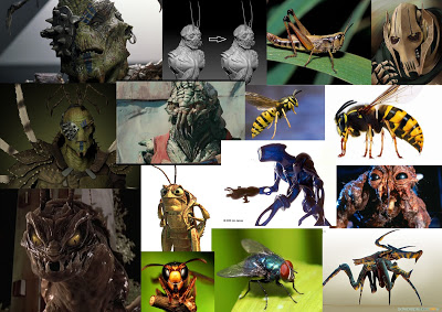
GAMEPLAY AND INTERACTIVITY - 2D GAME - PIXEL ART / ANIMATIONS
After our concept art we refined ideas, and decided pixel art would be best and the most efficient way of working. This process was enjoyable and was a great art asset to complete and lean how to do.

This is the pixel form of the jock enemy from the concept art. I created an idle pose for him for the game, and was able to keep characteristics of the concept art in the pixel art.


 I then created a walking animation for him. This was quite tedious and hard to get the right body movement of walking. However the results turned out good and the walking runs smoothly.


After that, a Variant version of the jock was created to so that this variation could be used in another level. Aging this was taken from the concepts of the color variations. This can be used in a background which contrasts, so the green doesn't get confused with a green background fro example.
Falling animation for the main character, this was particular hard to judge and get right as I had to add some frames and adjust aspects of each frame so that it could look natural as a falling animation instead of a dance or strange jump.


This is another variation created for another background. This was an idle animation for this character.


A unfinished death animation I created, Unfortunately I didn't get to finish this, for this enemy variation. I would have like to finish this and put it into one of the other level backgrounds.


I found the pixel art sprite creating very enjoyable, however tedious. It was great to use a different art style and play around with details and colours for the sprites. I would have like to complete walking, death and attack animations for all theses sprites, however I didn't get to round to doing that. I hope to use this art style again one day on another project.


Saturday 27 February 2016

VISUAL DESIGN - INSECT CREATURE - WEEK_07_TERM2

 INSECT CREATURE PART 1 MODEL SHEET

For this brief, the task was to create an original insect creature. This was a two week homework, part 1 consisting of sketches and a model sheet of the insect creature. This was a great brief and I really enjoyed part 1 and look forward to part 2, which was a three quarter view of the insect creature.


The first thing I did was create a mood board for reference and aspiration. I used creatures from different media, such as films and games and also real life insects, to come up with an Idea for a original creature. 

After the mood board I then moved onto some sketches for the design of the creature.


The first bug was a tall hulking creature that was based off of a many different insects, primarily the wasp, as the head shape is similar to a wasps body. I like this design as it is a frightening looking and could have some interesting features to explore when rendering. 


This sketch was a more hunched and slow creature, formed from a wasp, a fly and  parts of a prey mantis, this design I like however don't see myself continuing for the final parts of this brief. 


The next creature I really liked and thought it wasn't overly cliche of insect parts and wasn't too human looking either. I like the inclusion of the four wings and the exaggerated thorax. 


I used this as the final creature, and I really like the design. However, I may add an extra set of arms to the lower chest, a small pair of them, to give the creature more insect feature. This is something I can explore with the three quarter view part of this brief. 


The model sheet I created for this character, was a front back side view of the creature. I used simple flat color to suggest were the light and dark areas would be. This is also something I can explore when doing the second part. Overall for part 1 I really like the creature and look forward to creating the second piece. 


 INSECT CREATURE PART 2

For the second part of the brief, I created my insect creature in a three quarter view, and did the style flat tones from light to dark. I like the outcome seen below, however I want to now do a version with the colours blended more, as I want to better myself when it comes to painting and blending with Photoshop. I am currently in the process of this blending process, below is the block colour not blended version.  Also the wings look a lot like whip cream, and I will perhaps add textures to them or change them to be more insectoid.


Process of work. Started with basic quick sketch formed from my own initial quick sketch book ones, then developed it into construction lines. From this, I turned it into sketchy black comic lines. I kept the sketchy feel to add to the insects personality and look less like a human.


Overall I really enjoyed coming up with an original idea for parts 1 and 2 and liked the painting process. I still want to practice painting more on this piece so I will upload another version, With blended painting technique. 


Friday 26 February 2016

VISUAL DESIGN - COLOUR THEORY - YODA

CLASS WORK - YODA COLOUR THEORY 

Today in lesson we were shown a very helpful and great tutorial on how to use colour, and apply colour throaty to  a piece. The brief was to colour two pictures of Yoda, in tow different ways. One was to use colours opposite to each other on the colour wheel and make a de-saturated dull tone one. 


The colours used for this paint over were medium tones of green and yellow opposite to a darker reds and pinks. I really like the outcome of this first one as it looks in keeping with the character and the colours fit nicely together. 

The second one was a saturated version using colours that were near to each other on the colour wheel. For this I used strong greens and dull yellow and browns, and even some blue. I still like this piece however it is a bit overly saturated and would have been better had it been a little less striking on the eyes when initially viewing it. 
Overall This class work was very interesting a good fun I also learnt a lot more one colour theory that I didn't know and will defiantly use this tutorial as a reference for future pieces. 

Sunday 14 February 2016

VISUAL DESIGN - SPEEDY PAINTING - WEEK_04_TERM2


SPEEDY ART PAINTING
This was a quick speedy paint concepts that I did in the session and came up with some strange and different designs for a fish creature. This was a good session as it improved our skills with speed painting and how to do many small quick sketches in order to for the final outcome. I will use this method a lot in the future as ti was helpful and very useful to to. 


Friday 12 February 2016

3D DESIGN - HANDS

3D DESIGN - HANDS 
Another process of the 3D statue, was  to create some hands for it, along with the previous head model. 
 Using the images, I was able to go over these to then create my hands, using side and top, and perspective views, in Maya. 


I found this process very taxing and at times frustrating, as there were many intricate details, needed to get right. I even found this to be the most difficult part of the statue process, as my statue is fairly basic, so far, using around 5,000 tris. I think the hands look decent, however I would have liked to have spent more time on them to make them fit 100% with the statue itself. Other than that this was a good process and one vital for future work. 

SPEEDER - CLASS WORK

SPEEDER CLASS WORK PERSPECTIVE 

In this session, we were given the task of creating a speed in three point perspective. This was a great brief as it help me get better at using perspective and understanding it. 


I firstly set out the guide lines then did a asic shapes layout of where the parts of the ship will go. This helped me to build the speeder in parts in perspective and was much more straight forward. 

This was the very basic quick outcome f the speeder that I ended up with. I would like to perhaps finish this off properly and make the perspective correct. Other then that I think its fine for a basic speedpaint session. 

Wednesday 10 February 2016

LIFE DRAWING - LAST SESSIONS

LIFE DRAWING - LAST SESSIONS 


Drawing of my own hand, which iam please with as I find hands difficult to draw. 


Quick warm up sketches. 


For this piece we had to study the model for a few minutes, then drawing from imagination and memory as to what the looked like. The one on the left is just looking at the model and without looking at the page. I found this very interesting as to the result which is almost abstract. As where the right hand one is from memory. 


The next few are using colour, and playing round with warm ans cold tones of shadow, and what is close/far from you. 


This was created using pens, to showcase warm and cold and distance.Had I had more time, I would have completed this, making it look more like a painting. 


I then went on to use chalks which I really found myself liking and being very pleased with the outcomes. 


This final one, I am very pleased with. I enjoyed this process a lot and have learnt a lot about colour theory and warm and cold colours and how to apply them. 

GAMEPLAY AND INTERACTIVITY - 2D GAME - ENEMIES CONCEPT ART

 ENEMIES CONCEPT ART


When we were coming up with the enemies, I made a mood board of some male dreamworks characters that I thought could be used as a idea for what the enemies could look like. 


I then made a Hipster mood board, as all enemies are Hipsters in our game. So I made a mood board to gives us ideas of the design and clothing. 


An initial design was to have a muscular bag guy as an enemy, in which we still may include if we get time to have "boss" level. 


I then used the mood boards to come up with some initial designs that I found did work and that I could then adapt into further designs. Experimenting with the colours of their clothes that we could use in the game.


This was the first hipster enemy I came up with and it fit the brief we were going for. 


Some different facial expression for the first enemy. I really like creating this character and the other enemies as we could use some hipster cliches. 


Then I made a full body image of the enemy and then I was able to colour him. 


I coloured him on Photoshop, using my tablet and the applied a chalke texture over the top to give the concept some more character. I used the same process for other enemies. 


After the first colour I then did some other colours for him so he could fit in if we changed the background/level and environment. Also adding some variation. 


The next enemy was taken again from the initial designs because I really liked the exaggerated hair and the clothing, this was different enough from the first enemy yet very different and fun. 


Again like the first, I drew a full body image of enemy 2 and then moved on to colour work, for this character. 


This was the drawing I then coloured as fro the next concept page. 


Again using the process of how I coloured the first guy onto this and the results I'm very pleased with. 

Also like the first, I changed specific colours to match the environment for when we change the level design. This will continue over to when we do our pixel art. 

The final thing to do was to create a silhouette page of this character to use as a guide for when we do our animations, this was a great help and was good to do.