ENEMIES CONCEPT ART
When we were coming up with the enemies, I made a mood board of some male dreamworks characters that I thought could be used as a idea for what the enemies could look like.
I then made a Hipster mood board, as all enemies are Hipsters in our game. So I made a mood board to gives us ideas of the design and clothing.
An initial design was to have a muscular bag guy as an enemy, in which we still may include if we get time to have "boss" level.
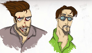
I then used the mood boards to come up with some initial designs that I found did work and that I could then adapt into further designs. Experimenting with the colours of their clothes that we could use in the game.
This was the first hipster enemy I came up with and it fit the brief we were going for.
Some different facial expression for the first enemy. I really like creating this character and the other enemies as we could use some hipster cliches.
Then I made a full body image of the enemy and then I was able to colour him.
I coloured him on Photoshop, using my tablet and the applied a chalke texture over the top to give the concept some more character. I used the same process for other enemies.
After the first colour I then did some other colours for him so he could fit in if we changed the background/level and environment. Also adding some variation.
The next enemy was taken again from the initial designs because I really liked the exaggerated hair and the clothing, this was different enough from the first enemy yet very different and fun.
Again like the first, I drew a full body image of enemy 2 and then moved on to colour work, for this character.
This was the drawing I then coloured as fro the next concept page.
Again using the process of how I coloured the first guy onto this and the results I'm very pleased with.
Also like the first, I changed specific colours to match the environment for when we change the level design. This will continue over to when we do our pixel art.
The final thing to do was to create a silhouette page of this character to use as a guide for when we do our animations, this was a great help and was good to do.


No comments:
Post a Comment