Thursday, 21 January 2016

GAMEPLAY AND INTERACTIVITY - 2D GAME - INITIAL CONCEPT ART AND MOOD BOARDS

 2D GAME - INITIAL CONCEPT ART AND MOOD BOARDS 

After deciding the what our key mechanics and style of the game would be, it then came time for the initial concept art for characters, backgrounds and weapons.

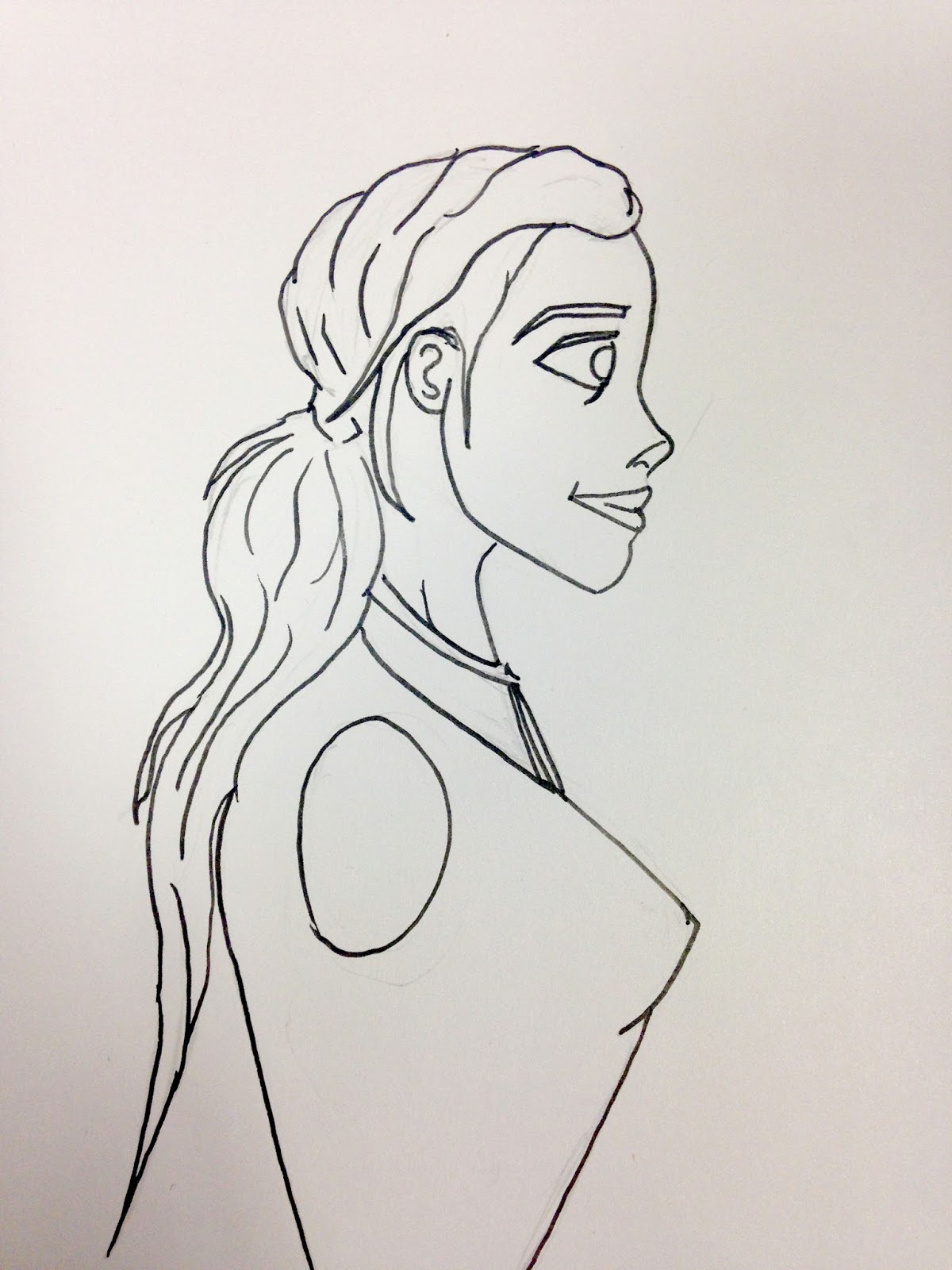
The first thing we decided was to have a female lead protagonist character. We found that having the long hair wold add to the feel of the characters movement without having the clothes too flowing. I created this mood board to show some ideas for our character, the character would be Disney/dreamworks minimal style as at first we were going to do this style but did quickly decide to do pixel art as the player wouldn't see much detail when playing.


At first the designs started off as a muscular female, similar to lara croft. However we decided we wanted a more agile character who could move fast and appear more streamline. 


Once the build of the character was found, we started looking at what clothing we could use and what could be used to show movement in game. The first thoughts were a puffer bomber jacket and large baggie pants, however we found  this didn't look good at the size we wanted and didn't show movement well. 


So we opted for a more streamline and less clunky costume. This consisted of legging type bottoms and the jacket which was less puffy and more tighter fitted. 


After this I played around with the facial construction for the character. I found the cartoon approach better than an realistic one, to fit the themes of the game, and long hair instead of short, as the hair could act as a way of showing motion. I also found the design I didn't like, and thy were in need of serious adjusting, if they were to look better than a "crazed" character seen in the left hand image. 


I refined the design to be more dreamworks/disney style which is what I continued throughout all my initial concepts for the characters. 


I the made a quick sketch page of different poses, very rough, that I could use when it comes to ding the pixel art animations for the game. These were very helpful and helped communicate the feel of movement in the character. 
Here were some different face expressions I did for the cartoon concept art, these were good to do as I wanted to do more poses for the character in this version of the art, however we decided we were going to move ahead with the pixel art. 


This was the final version of concept art we decided to go ahead with, and develop into pixel art. I really enjoyed this process and liked coming up with the different looks for the character. This style also fits with the enemies concept art style. 


I then decided to do a model sheet of the character with her sword to show size difference and clothing hair etc. 


This is some other concept art from another member of our group. We decided from this that the characters clothing would be quite dull and basic, and she would have bright hair. The hair would suggest motion as she moved, as before we said a scalf or the cloths would do this, but we decided to make it more simple and have just the hair and a ribbon attached to the sword to show movement.


Another earl piece of concept work, when we were deciding what the character would look like and what she would wear, another group member thought that goggles would be a great choice because of the characters constant fast movement. This first concept then helped us to move forward and change aspects that would be better for use, for example longer flowing hair as opposed to short motion less hair.


This sword mood board  I made when we were coming u p with the design of the sword. It originally started off as a giant rectangular sword, however we found a more streamline cutlass type sword would fit the them of movement well and also look better with the character. 

I then drew up a front facing image of the character, so that I could colour it like the other pieces of concept art for the enemies.


Monday, 18 January 2016

VISUAL DESIGN - PAINT OVER TECHNIQUES - CLASS WORK

 PAINT OVER TECHNIQUES
GUN AND BAT CREATURE


Using Photoshop techniques to overlay images onto simple greyscale images. The first was the gun barrel. 


This was created by using a image set to overlay, and then skewed and transformed, to fit the shape of the barrel so that the texture looked like it was bending round the object.


This bat creature was a class piece I did. I started with a black and white image of the bat, then had to use paint over techniques to apply yo it. I got some textures of skin and creatures and photo bashed them together with the Photoshop brush and paint and also the adjustments to the textures, to make a veined and grotesque creature.


For the second version of the bat creature, I downed the saturation and made it more dark and as if the creature was creeping from the shadows. Both of the paint overs, I really like and I enjoyed this task a lot, and want to do more of it in the future.


Sunday, 17 January 2016

VISUAL DESIGN - ANATOMY- MUSCLES 2 WEEK_03_

ANATOMY - MUSCLES PART 2

Continuing our muscle anatomy work, I did the next part, which was to draw two bodies n one page, front and back, and label all key muscles. 

Overall I feel as if I could have done a much better job on this drawing as I feel It looks quite bad and not to my best standard. I will re-do this soon as Im not too happy with what I have done. However the labeling was good as I knew where a lot of the muscles were, without a help sheet.


Saturday, 16 January 2016

GAMEPLAY AND INTERACTIVITY - 2D GAME - INTRODUCTION


INTRODUCTION - FIRST GROUP THOUGHTS - AND MILESTONE REVIEW


When our group got together, we decided we wanted to have a game where the main focus was the constant need for movement and some sort of tool that would allow for this to be done smoothly. We wanted the mechanics of the game to be grappling look focused and for this to aid with movement and momentum. This would be on a momentum bar, so when movement is halted it would act as punishment to the player.


Our model sheet outlined the key aspects of our game. We wanted to make a hyper violent momentum based plat former, which required fast smooth movement. The main mechanics revolved around constant movement, Grapple hook movement and a reliance on not being stationary.  


These were the first ideas, for what the characters and environments could be like for our game. We wanted to have a dreamworks/ Disney style, and were deciding on having 3D modelled characters in the game. However from out meeting with Ewan, this turned out to be a wrong idea. We decide to go for 2D sprites, weather it be pixel art or vector etc. This proved great as it was much simpler than the ridiculously ambitious 3D models!


Early concepts for what a very basic version of our level would be. Character not too small or overly big, momentum bar top right, as indication of movement and points. Depletes when stationary.


An image of a rough concept for the main menu which has been complexly updated to suit our theme and style.


Sunday, 10 January 2016

VISUAL DESIGN - ANATOMY - MUSCLES WEEK_01_ TERM2

ANATOMY - MUSCLES PART 1 

Continuing the anatomy project in visual design this week was to study some of the key aspects of the anatomy, in this case muscles. Part one was the key muscles. 


I stuck with a variety of different muscles which were located all around the body. I tried not to make to many from the same location, on the same page. So ended up choosing  to mix up the locations of the key muscles. 


LIFE DRAWING - UPDATE 2

LIFE DRAWING - UPDATE 2 


Close ip hand detail sketch. 


Labeled anatomy 


Warm up sketches of the model 


Using both hands and the same time. the results I like. more so the left as the right hand is out of proportion and off center. 


More quick 3 min sketches of the model, for warm up. 


Sunday, 3 January 2016

VISUAL DESIGN - CHRISTMAS HOMEWORK - SKELETONS

CHRISTMAS HOMEWORK - SKELETONS 

For our Christmas task we were set to study the human anatomy, in particular the skeleton. I Learnt which bones were called what, from a list we were given. I then  sketched up some of the important bones in my sketch book, as this was the first task f the homework.


I drew up a variation of bones from the anatomy list we were given. Some which I knew and some which I didn't know what or where they were on the body. The skull is my favorite of all as it looks the most realist and I like the angle it is on. However I would have liked to add some shading to it and the other bones. 


I kept my three skeletons fairly simple however I had to include detail to use to label the different parts. The middle is my favorite of the three because it includes all of the skeleton, the first one cut of slighting so I would perhaps move it up a little so the feet can be included in it. 

I distributed the labeling across all three including some joints and all the listed parts of the anatomy, plus some more. This was a good and fun exercise to do because I like working with traditional media as I am used to using this for other previous art projects.