Sunday 17 April 2016

3D DESIGN - STATUE IN UNITY

3D DESIGN - STATUE IN UNITY 
Finally, I put my statue in unity, into the battle arena scene. I had already allocated a space for where this could go last term, ans it would be centered in the middle of the arena in the center floating platform. 

I am pleased with how this turned out, the texture fits aesthetically with the rest of the arena, as does the model. The ominous presence of it add to the gloom and dark theme of the scene itself. 
This project overall has been an enjoyable one, as I have learnt many valuable things to do with 3D model making and texturing. I do wish to continue developing my skills for the future as Iam looking forward to next years work! I do however wish that some deadline weren't pushed back so close to one another, allowing for flexibility of hand in, as opposed to one week. Then I feel as if I could have improved the battle arena significantly had time not been quite limited. But I am still happy with the outcome, and will perhaps create my own version of a battle arena in spare time, for own work/ experimental purposes. 

Saturday 16 April 2016

3D DESIGN - STATUE UV UNWRAP AND TEXTURE

3D DESIGN - STATUE UV UNWRAP AND TEXTURE 
After completing the statue, I then began the UV unwrapping process. This was again fairly challenging, as I didn't want to make unnecessary seem lines. I used the planar unwrapping method, an found this easier than stitching each individual piece together with one another.  

The most difficult section of the body to unwrap was the body, because it took many attempts to correctly unwrap and smooth the UV without it messing up. However once I completed this, it turned out great. 
The image on the left is a snapshot of the UV. I then took it into Photoshop, and then began to texture. The image top right is a plane flat grey colour used for the base. Below left is the texture layer applied. I used a worn and weathered scifi steel. This was in keeping with the battle arena textures and theme. The bottom right, is the ambient occlusion layer, highlighting the shadow areas. 
I am happy with how this eventually turned out, as the texture is a good one which does fit well with arena itself. However, I would have liked to customize the texture a little, more adding dirt and other elements of wear. But other than that I think this turned out quite good, and I really enjoyed the process of texturing, more than unwrapping, but I have learnt more about unwrapping now, which is also very helpful. 

Tuesday 12 April 2016

VISUAL DESIGN - SCI-FI FUTURE SHIP

VISUAL DESIGN - SCI-FI FUTURE SHIP
For this sci-fi brief I was given the task of creating a future ship weather fighter or transport ship, and create a 3D model of it, then light it up and do a paint over.
I started with a mood board for a transporter, because I found a transporter to be more realistic as to what we could have in the future. I found designs that I liked and that suited what ship I wanted to create. 


After coming up with designs I came up with the rough designs for a transporter, that I could then adapt into 3D. I knew I wanted to make a square shaped ship with hover base on the bottom, that had two large engines. 
Once finished, I rendered up some images, of the ship with some different lighting. I found the one I like the most was a three quarter view from the right. I really like my design and how it ended up looking, however I would have made the ship features less tacky so its not cliche future accessories. 

For the final paint over, I used some dirt and rough worn textures, set to overlay and then put a grey blue, very very pale blue wash , as I didn't wan the colour to be too overwhelming. Lastly added some lights to the top and front, and am pleased with the overall result if a little cliche although I like the almost reto design


Wednesday 30 March 2016

3D DESIGN - STATUE PROCESS


This was the model sheet I made, with topology lines, so I was able to go over this in side, front and perspective views in Maya to closely create a 3D version of this initial mood board. 
After the initial mood board and model sheet of my mock statue that I made, I then took the images into MAYA and used the method I used for the first head to create my own statue. The process was great and I have learnt many new techniques in maya, so of which I can use to improve old work such as using vector merging for cleaner results, for the battle arena. 

The first step was the half face section. I completed the whole side of the face. Once done, I then mirrored the mesh and connected the middle section. This was much easier that trying to copy wat you have all ready done. 


I then extruded done and over the template I created so I could create the rest of the body. As I worked down, I adjusted the back to how I wanted it, this way I could follow the curved back. 


I continued the mirroring process throughout the model all way down. This way it kept its symmetry. 


Once I had done all the mirroring to the body, I added some extruded details and removed some of the inside faces. I am very pleased with how the statue turned out as looked a lot like my initial designs/ideas and fits well with the theme of the battle arena, which was the cold war inspired sci fi robot. 

When texturing I will use a worn dark to mid grey tone texture with some weathering and broken parts, which I will paint and create in Photoshop. As for the position I will have the arms come down and in like the original statue but with more curve to the arm. 


Wednesday 23 March 2016

LIFE DRAWING LAST SESSION


Some quick warm up sketches to help get a feel for the clothes on the model. As this session the model was clothed. This allowed for some unique texture patterns and marks I could make.


I used the sides of the charcoal, to suggest texture on the robe.


Overall I have really enjoyed the life drawing session. They have helped me to understand the human form better and also improve my drawing skills significantly. I hope we continue this next year even if session are more sparse. I have seen a great improvement in my work, from the start of the year till now, and it is great to see this process.

Wednesday 9 March 2016

VISUAL DESIGN - SPEEDPAINT - HOUSE

VISUAL DESIGN - SPEEDPAINT - HOUSE
The next speed paint session was to recreate an image of a western house. However, we needed to make the image use the rule of thirds, or the golden ration.
This was a quick half of class session that didn't take long. Iam quite pleased with how this turned out In the short amount of time. However I would have liked to add more texture by using different brushes, but other than that I like this piece and enjoyed working on it.


Monday 7 March 2016

CONSTRUCTION VEHICLES - ANGLES AND CIRCLES

CONSTRUCTION VEHICLES - ANGLES AND CIRCLES    

For this classwork we had to come up with concepts for a futuristic construction vehicle using angular shapes, and ones with circular shapes. This was to get us familiar with shop concepts before we started the homework which is our own ship. 


I started with the angular shapes version and really enjoyed this process of creation. I found myself wanting to create more different design as I moved forward wand was excited by the out come I would get. I worked quickly and glided through these designs. Although they may appear a bit messy, I find working quickly and letting my hand glide is a great way to create the specific shapes and parts of the vihichels or any design. However I do need to work more on the neatness of my work. 
I found out of all this was my favorite, because it wasn't too futuristic and you can still tell its a construction vehicles, it also sticks to th brief of angular shapes. Like I mentioned earlier, I need to work on neatening my work up so it looks more professional. 


The circles section of the brief I initially found easier, but when continuing with the brief it then became more challenging to create construction vehicles using mostly circles then angular shapes. I like all my designs as they are all different from each other and not overly similar. 

I finally chose this to be the one to got with, as I like the large clunky old feel to it. this was the only one I drew front facing as I wanted yo show the dirt scooped on the front as well as both the side legs. I still however need to keep improving on my presentation and ability of neatness within my work. this is something I found quite obvious when doing this brief. 


Sunday 6 March 2016

VISUAL DESIGN - TREE WITH CHARACTER

TREE WITH CHARACTER 

This weeks visual design work, was to create a tree which had character. This meant a tree that was very contorted and expressed different visual elements that are interesting. Instead of just a tree with a face.


I firstly created a mood bard for reference to help me get some interesting shapes and curves when doing the sketches. This was very helpful as it gave me something to work from when coming up with shapes and structure to the trees. 


I used the silhouette method to do sketches and these turned out well, and I enjoyed doing these small sketches. I found myself deciding what tree I would eventually use, as I liked all the sketches I drew out. This was a Fun and great brief and I really enjoyed it. 


The two I found very interesting on this sketch page, was the bottom left and middle right. I found they were great to adapt and I really wanted to explore theses further. 


After the sketches I quickly came up with another design, that I found myself liking a lot. I planned a quick composition of a landscape with the tree in foreground, and also applied the golden ration to it so that the mountains guide the eye to the focal of the tree. 

Once I had coloured the piece, I added in some rim lighting. This was great to use as It gives the pieces some more levels instead of looking a bit flat. This was also very good to use and get myself into using in the future. 


I finally added some clouds and then a glow around the sun, to add some extra details to it. I found the rendering for this quit difficult as I didn't know how to properly balance the mountains from the tree. I still feel as if the piece lacks something and I may explore this piece further when I have available time. However I still enjoyed this brief a lot and want to work on improving my lighting skills and painting. 


Sunday 28 February 2016

GAMEPLAY AND INTERACTIVITY - 2D GAME - PIXEL ART AND ANIMATIONS


GAMEPLAY AND INTERACTIVITY - 2D GAME - PIXEL ART / ANIMATIONS
After our concept art we refined ideas, and decided pixel art would be best and the most efficient way of working. This process was enjoyable and was a great art asset to complete and lean how to do.

This is the pixel form of the jock enemy from the concept art. I created an idle pose for him for the game, and was able to keep characteristics of the concept art in the pixel art.


 I then created a walking animation for him. This was quite tedious and hard to get the right body movement of walking. However the results turned out good and the walking runs smoothly.


After that, a Variant version of the jock was created to so that this variation could be used in another level. Aging this was taken from the concepts of the color variations. This can be used in a background which contrasts, so the green doesn't get confused with a green background fro example.
Falling animation for the main character, this was particular hard to judge and get right as I had to add some frames and adjust aspects of each frame so that it could look natural as a falling animation instead of a dance or strange jump.


This is another variation created for another background. This was an idle animation for this character.


A unfinished death animation I created, Unfortunately I didn't get to finish this, for this enemy variation. I would have like to finish this and put it into one of the other level backgrounds.


I found the pixel art sprite creating very enjoyable, however tedious. It was great to use a different art style and play around with details and colours for the sprites. I would have like to complete walking, death and attack animations for all theses sprites, however I didn't get to round to doing that. I hope to use this art style again one day on another project.


Saturday 27 February 2016

VISUAL DESIGN - INSECT CREATURE - WEEK_07_TERM2

 INSECT CREATURE PART 1 MODEL SHEET

For this brief, the task was to create an original insect creature. This was a two week homework, part 1 consisting of sketches and a model sheet of the insect creature. This was a great brief and I really enjoyed part 1 and look forward to part 2, which was a three quarter view of the insect creature.


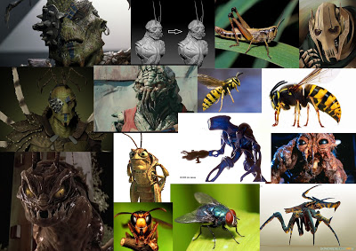
The first thing I did was create a mood board for reference and aspiration. I used creatures from different media, such as films and games and also real life insects, to come up with an Idea for a original creature. 

After the mood board I then moved onto some sketches for the design of the creature.


The first bug was a tall hulking creature that was based off of a many different insects, primarily the wasp, as the head shape is similar to a wasps body. I like this design as it is a frightening looking and could have some interesting features to explore when rendering. 


This sketch was a more hunched and slow creature, formed from a wasp, a fly and  parts of a prey mantis, this design I like however don't see myself continuing for the final parts of this brief. 


The next creature I really liked and thought it wasn't overly cliche of insect parts and wasn't too human looking either. I like the inclusion of the four wings and the exaggerated thorax. 


I used this as the final creature, and I really like the design. However, I may add an extra set of arms to the lower chest, a small pair of them, to give the creature more insect feature. This is something I can explore with the three quarter view part of this brief. 


The model sheet I created for this character, was a front back side view of the creature. I used simple flat color to suggest were the light and dark areas would be. This is also something I can explore when doing the second part. Overall for part 1 I really like the creature and look forward to creating the second piece. 


 INSECT CREATURE PART 2

For the second part of the brief, I created my insect creature in a three quarter view, and did the style flat tones from light to dark. I like the outcome seen below, however I want to now do a version with the colours blended more, as I want to better myself when it comes to painting and blending with Photoshop. I am currently in the process of this blending process, below is the block colour not blended version.  Also the wings look a lot like whip cream, and I will perhaps add textures to them or change them to be more insectoid.


Process of work. Started with basic quick sketch formed from my own initial quick sketch book ones, then developed it into construction lines. From this, I turned it into sketchy black comic lines. I kept the sketchy feel to add to the insects personality and look less like a human.


Overall I really enjoyed coming up with an original idea for parts 1 and 2 and liked the painting process. I still want to practice painting more on this piece so I will upload another version, With blended painting technique.