Sunday, 14 February 2016

VISUAL DESIGN - SPEEDY PAINTING - WEEK_04_TERM2


SPEEDY ART PAINTING
This was a quick speedy paint concepts that I did in the session and came up with some strange and different designs for a fish creature. This was a good session as it improved our skills with speed painting and how to do many small quick sketches in order to for the final outcome. I will use this method a lot in the future as ti was helpful and very useful to to. 


Friday, 12 February 2016

3D DESIGN - HANDS

3D DESIGN - HANDS 
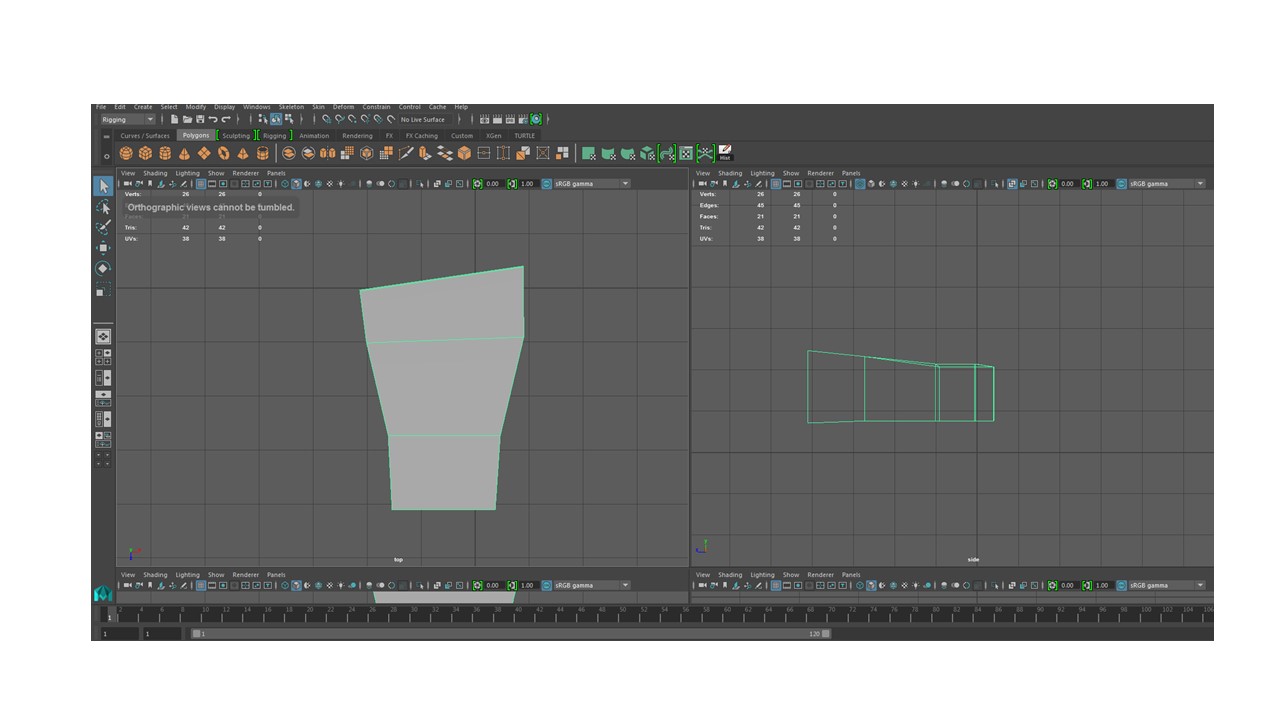
Another process of the 3D statue, was  to create some hands for it, along with the previous head model. 
 Using the images, I was able to go over these to then create my hands, using side and top, and perspective views, in Maya. 


I found this process very taxing and at times frustrating, as there were many intricate details, needed to get right. I even found this to be the most difficult part of the statue process, as my statue is fairly basic, so far, using around 5,000 tris. I think the hands look decent, however I would have liked to have spent more time on them to make them fit 100% with the statue itself. Other than that this was a good process and one vital for future work. 

SPEEDER - CLASS WORK

SPEEDER CLASS WORK PERSPECTIVE 

In this session, we were given the task of creating a speed in three point perspective. This was a great brief as it help me get better at using perspective and understanding it. 


I firstly set out the guide lines then did a asic shapes layout of where the parts of the ship will go. This helped me to build the speeder in parts in perspective and was much more straight forward. 

This was the very basic quick outcome f the speeder that I ended up with. I would like to perhaps finish this off properly and make the perspective correct. Other then that I think its fine for a basic speedpaint session. 

Wednesday, 10 February 2016

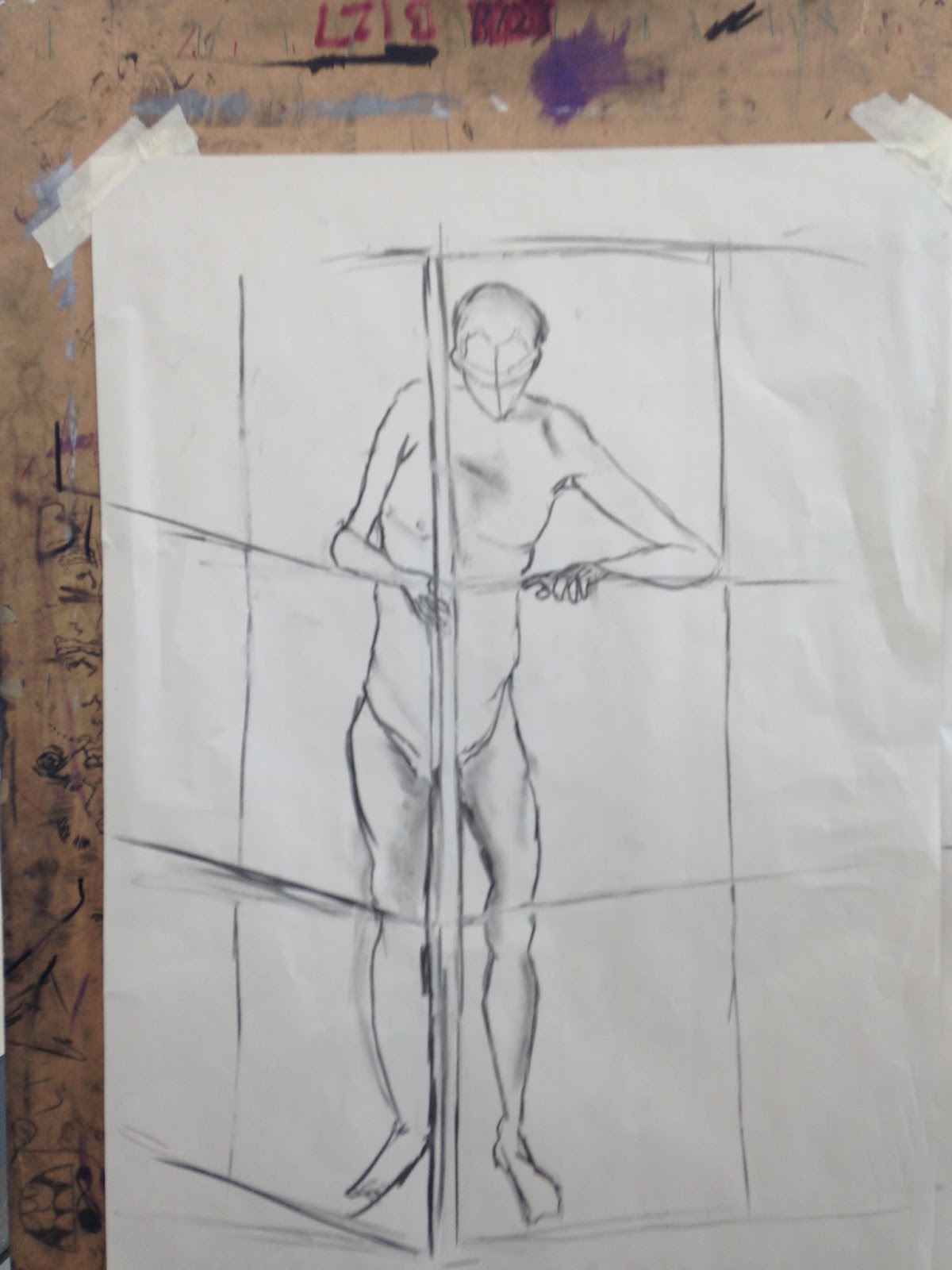
LIFE DRAWING - LAST SESSIONS

LIFE DRAWING - LAST SESSIONS 


Drawing of my own hand, which iam please with as I find hands difficult to draw. 


Quick warm up sketches. 


For this piece we had to study the model for a few minutes, then drawing from imagination and memory as to what the looked like. The one on the left is just looking at the model and without looking at the page. I found this very interesting as to the result which is almost abstract. As where the right hand one is from memory. 


The next few are using colour, and playing round with warm ans cold tones of shadow, and what is close/far from you. 


This was created using pens, to showcase warm and cold and distance.Had I had more time, I would have completed this, making it look more like a painting. 


I then went on to use chalks which I really found myself liking and being very pleased with the outcomes. 


This final one, I am very pleased with. I enjoyed this process a lot and have learnt a lot about colour theory and warm and cold colours and how to apply them. 

GAMEPLAY AND INTERACTIVITY - 2D GAME - ENEMIES CONCEPT ART

 ENEMIES CONCEPT ART


When we were coming up with the enemies, I made a mood board of some male dreamworks characters that I thought could be used as a idea for what the enemies could look like. 


I then made a Hipster mood board, as all enemies are Hipsters in our game. So I made a mood board to gives us ideas of the design and clothing. 


An initial design was to have a muscular bag guy as an enemy, in which we still may include if we get time to have "boss" level. 


I then used the mood boards to come up with some initial designs that I found did work and that I could then adapt into further designs. Experimenting with the colours of their clothes that we could use in the game.


This was the first hipster enemy I came up with and it fit the brief we were going for. 


Some different facial expression for the first enemy. I really like creating this character and the other enemies as we could use some hipster cliches. 


Then I made a full body image of the enemy and then I was able to colour him. 


I coloured him on Photoshop, using my tablet and the applied a chalke texture over the top to give the concept some more character. I used the same process for other enemies. 


After the first colour I then did some other colours for him so he could fit in if we changed the background/level and environment. Also adding some variation. 


The next enemy was taken again from the initial designs because I really liked the exaggerated hair and the clothing, this was different enough from the first enemy yet very different and fun. 


Again like the first, I drew a full body image of enemy 2 and then moved on to colour work, for this character. 


This was the drawing I then coloured as fro the next concept page. 


Again using the process of how I coloured the first guy onto this and the results I'm very pleased with. 

Also like the first, I changed specific colours to match the environment for when we change the level design. This will continue over to when we do our pixel art. 

The final thing to do was to create a silhouette page of this character to use as a guide for when we do our animations, this was a great help and was good to do.  


Tuesday, 2 February 2016

3D DESIGN - HEAD MODEL

3D DESIGN - HEAD MODEL
Part of the statue process, was o create a head model. This was to be used for own own statues if desired. Or to then sculpt into another model for the statue. My statue, is going to be a robotic figure, so This head I wont use on the final statue. 

I took the liberty to sculpt this into my own version. I moved the eyebrows down and the jaw line in more, also made the nose bridge less exaggerated. I made the whole head look more menacing from the sculpt I ended up with. This was a great exercise, and I found it easier to move onto the actual statue from this. 


Overall I like this head model. The process of making it was great and tough me a lot of important factors, for crafting a 3D head, such as starting from the eyes and working out. I do however wish it was slightly less Tris as it did end up being 20,000 plus, once smoothed.  I hope to use this model in the future or maybe even to use it as a base to practice sculpting techniques or other head models.  

Monday, 1 February 2016

VISUAL DESIGN - STEAM PUNK - WEEK_04_TERM2

STEAM PUNK CHARACTER 

For this brief, we had to create a steampunk item of our choosing, weather a character, weapon or item, and have a brief understanding of the origins of steampunk. 

I first created a mood board of ideas for a character I could do. I wanted to do a character as I want to increase my skill with character drawings, and understanding of forms.


I decided to do a cel shaded piece, after thinking about which would look good for the illustrations I had draw as initial ideas. As I also want to make myself more comfortable with this style as well as the other paining techniques.


Bust sketches of different styles of steampunk fashion. I wanted to make a character that wasn't overly cliche of steampunk, so I choices to add goggles and a suit piece, not over doing the steampunk feel. 


My Finished piece without the background. 


Both background are temporary, as I want to do a better one, that is in keeping with the style of the piece. However these two (green/gray) don't look too out of place. 


I really enjoyed this brief as it made my understanding of this technique more in depth, as I now know things for this process that I didn't before. I will use this method in the future as I really like doing it, but next time I will try and further my skills to make the work muck better.